Start with one workflow people already hate
Beacon only had about an hour, so the product had to explain itself almost instantly. The workflow that made that possible was simple: committees were still forwarding the same update into multiple Residential College house chats by hand.
That is the kind of problem I trust under hackathon pressure. It is specific, annoying, and understandable in one pass.
The user was not the audience
Committees do not need yet another app that asks students to change where they already talk. Students are already on Telegram. House chats already exist. The friction lives with the organizers, not the audience. That distinction mattered to me a lot because I really do not like demos that only work by pretending user behavior is infinitely flexible.
That observation shaped the whole product:
- the user was the committee operator
- the destination was the existing house chat
- the value was less forwarding, less inconsistency, less chaos
Pick The Right Surface
Why Telegram mattered
Telegram mattered because it was already where the communication was happening. I did not need to sell a new social surface. I needed to make an existing one feel less annoying to operate.
If I had tried to invent a completely new messaging surface, I would have spent the whole hour convincing people why they should care. By keeping Telegram as the delivery layer, Beacon immediately felt grounded in reality.
The product only needed to answer one question:
How do I make Telegram feel manageable when one committee has to reach multiple chats at once?
That let me frame Beacon as a control system rather than a replacement platform. I think that was the correct instinct. Products feel much more believable when they respect the behavior that already exists instead of trying to overwrite it for no reason.
Shape The Demo Loop
The four moments people had to understand
Under hackathon pressure, I think in terms of demo sequence more than feature count. I am much less interested in sounding impressive than in making the viewer nod along and think, “yeah, that actually makes sense.”
For Beacon, the workflow I wanted to make obvious was:
- connect the bot to the house chats once
- compose an announcement or poll from one place
- send it to one or many chats
- review the activity centrally instead of hunting through Telegram manually
That sequence is doing a lot of work. It makes the product feel operational instead of decorative. It also gives the judges or readers a clean story to follow without needing a long explanation. If the audience has to do too much interpretive labour, I feel like I have already failed a little.
Cut Scope Aggressively
What I refused to turn Beacon into
The hardest thing in a one-hour build is not deciding what to add. It is deciding what to protect. Anyone can keep adding features when they are panicking. The harder move is to stay annoyingly disciplined.
I cut anything that would distract from the central loop. I did not need Beacon to become a full committee operations suite. I needed it to feel believable as soon as someone saw the dashboard and understood what happened after pressing send.
So I kept asking myself:
- does this make the workflow clearer?
- does this make the product feel more real?
- does this make the demo easier to follow?
If the answer was no, I moved on.
That is why the product story stayed clean. It was never trying to do ten jobs at once. I am very glad about that in hindsight because I think Beacon would have gotten worse the moment I tried to make it “more ambitious” in the wrong way.
Make It Feel Like A Product
Why the supporting surfaces mattered
There is a difference between “I built a bot” and “I built a product.” I care about that distinction maybe more than is reasonable.
To make Beacon feel like the second one, I needed more than the Telegram integration itself. I needed the surrounding system to imply operations, history, and intent.
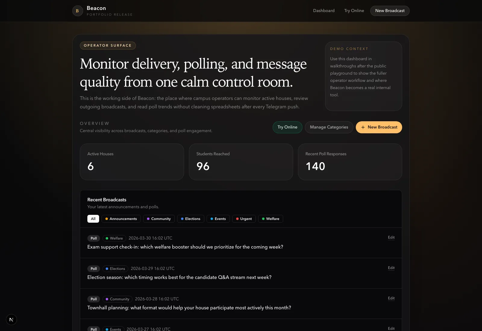
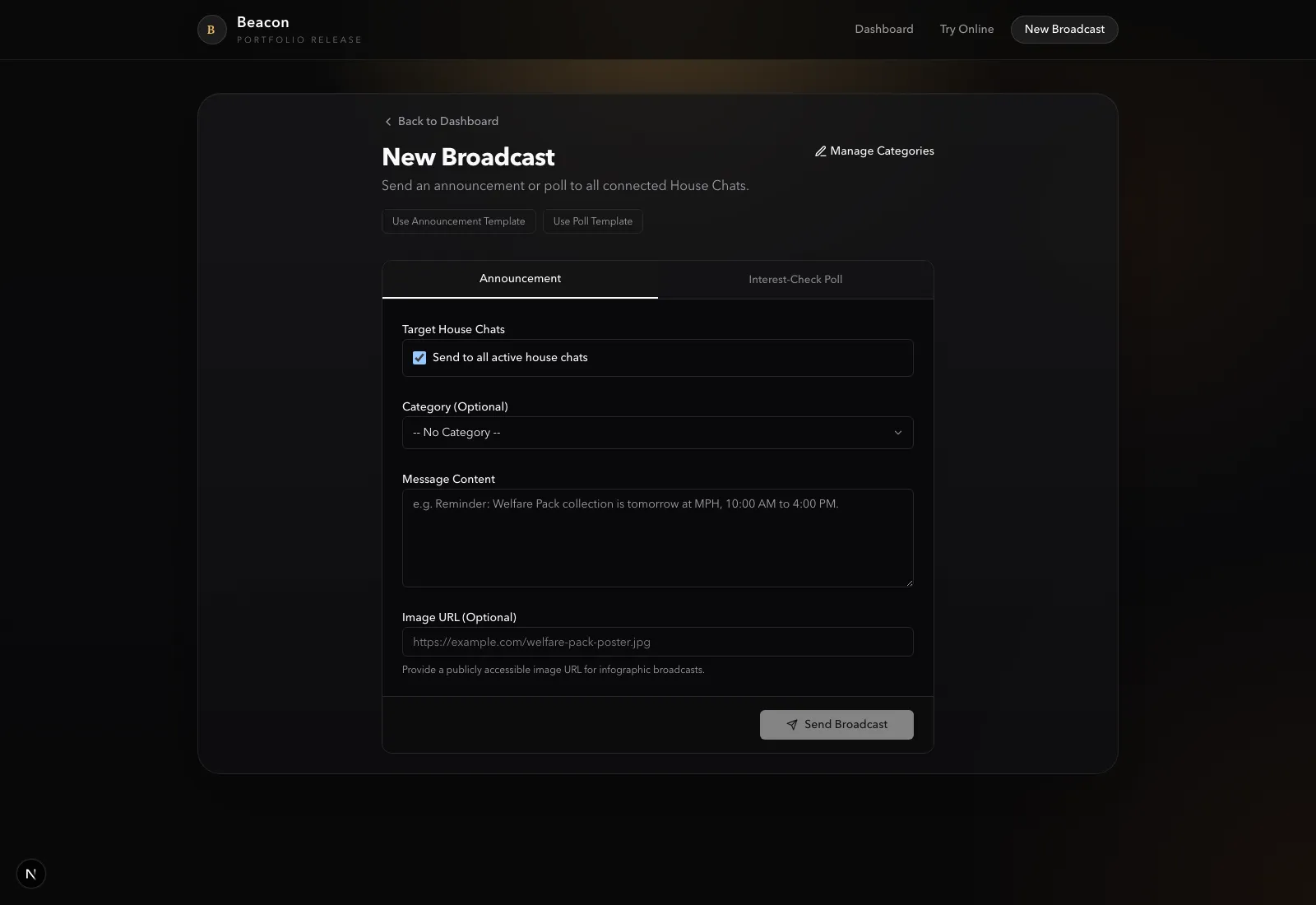
That is why the dashboard mattered so much. It gave the project a sense of ownership and continuity. The compose screen mattered because it turned sending into a deliberate workflow. The categorized history and poll summaries mattered because they made Beacon feel like something committees could actually return to instead of using once and forgetting. I wanted Beacon to feel calm, not frantic, even though I myself was absolutely frantic building it.
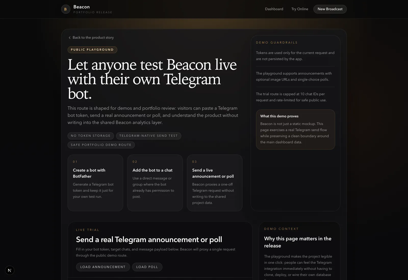
The public playground also helped. Even as a demo surface, it turned Beacon from a static pitch into something a person could imagine trying for themselves.
The Bigger Lesson
What I liked about Beacon is that the product became more understandable as I removed things. That is such an annoyingly recurring lesson in product work, but it keeps being true.
That sounds obvious, but it is easy to forget during hackathons. When the adrenaline hits, the instinct is often to keep adding. In this case, the better move was to hold the line and make one workflow feel complete enough to trust.
I felt the rush the whole time, but that urgency actually sharpened the decision-making. I did not need to chase the most complicated idea in the room. I needed the cleanest one I could ship fast.